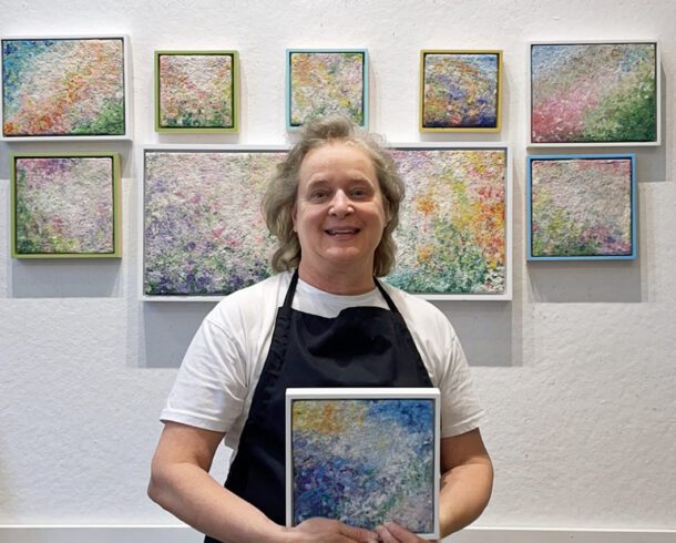
For 40 years, I taught art and architectural history, art education, and studio art at the college level. I loved my life as a professor, helping students launch their careers as artists and educators.
I decided to share my knowledge in this section, Tabloid Art History.
Art Nouveau was not a deliberate movement like those motivated by design reform. However, it can be considered a movement because its otherwise unrelated manifestations in several countries at the end of the 19th century share the same characteristics, including the rejection of historic styles, the use of modern materials and techniques, ornamental motifs based on forms from nature, and curvilinear shapes – most notably the “whiplash” curve.
The characteristics that make Art Nouveau design recognizable as a unique development are:
A few examples of Art Nouveau decorative objects. Notice the connection between slick design and nature inspired content.
•A rejection of Victorian styles and of historic imitation in revivals or through eclectic combinations of precedents.
•A willingness to take advantage of modern materials (iron and glass), modern techniques (industrial production), and such innovations as electric lighting.
•A close relationship with the fine arts, incorporating painting, bas-relief, and sculpture into architecture and interior design.
•The use of decorative ornamentation based on nature forms—flowers, vines, shells, bird feathers, insect wings—and abstract forms derived from these sources.
•Curvilinear forms as dominant themes in both basic structural elements and in ornamentation. The relationship to the generally curving and flowing forms of nature gave rise to the S-curves or “whiplash” curves usually regarded as the most visible Art Nouveau motif.
Art Nouveau announces the beginning of modernism in design and Architecture. It occurred at a time when mass-produced consumer goods filled the marketplace, and designers, architects, and artists came to realize that the handcrafted work of centuries past could be lost. While reclaiming this craft tradition, art nouveau designers simultaneously rejected traditional styles in favor of new, organic forms that emphasized humanity’s connection to nature. How to celebrate nature-inspired forms that differed from earlier attempts of the Aesthetic Movement was a challenge for Art Nouveau acolytes.
Ironically, while Art Nouveau represented the beginnings of modern design, the most ardent supporters of early modernism rejected Art Nouveau in favor of a paired down aesthetic of clean lines, white walls, and polished chrome.
Piet Mondrian and Theo Van Doesburg, writing in the early decades of the 20th century, were early proponents of this new modernism which consisted of reducing forms to their basic elements – vertical lines, horizontal planes and primary colors. In effect, they rejected all forms of “unnecessary” decoration inherent in Art Nouveau which they considered subjective and feminine. Given both of these artists were simultaneously publishers of the publication DeStijl (The Style), they were able to perpetuate their preference for simplicity in design, which further degraded art nouveau as a style.
As an artist whose work includes the whimsical shapes, whiplash curves, and bright colors inherent in art nouveau, I take issue with proponents of early Modernism’s admonishing these characteristics in favor of a paired down aesthetic. It’s not their preference for simplicity I object to, rather their commentary on decoration being associated with feminine subjectivity, which they deemed “too sensual.” When beauty is associated with weakness, and those who perpetuate this mindset have access to the written word, other modes of expression are shunned for an aesthetic that can be viewed as cold and uninviting. The “less is more” paradigm that followed the writing of the DeStijl school was paramount in the design world until the post-modern period and the work of Robert Venturi and Denise Scott-Brown.
In response to what Piet Mondrian and Theo Van Doesburg believed about vertical and horizontal lines taking precedent over the whiplash curve of Art Nouveau, I will continue to experiment with all sorts of shapes, color, and forms. They are welcome to their clean lines and white walls, while I will create curved, whimsical, and colorful art to cover those walls with aplomb and conviction.
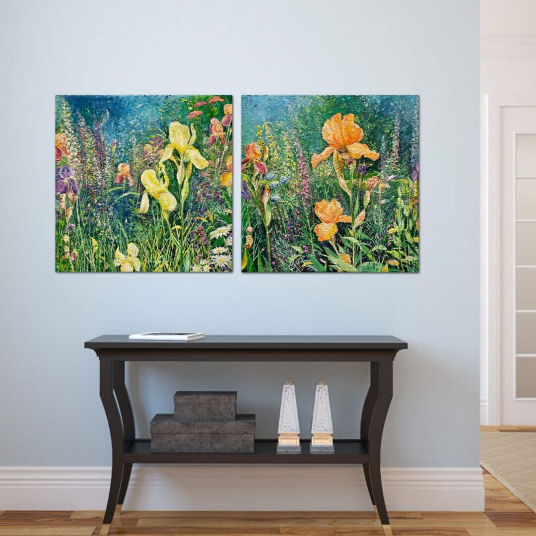
My garden paintings are in the tradition of Art Nouveau, a decorative style popular in the late 19th century. Art Nouveau is famous for its decorative aesthetic, bold colors, array of textures, and whiplash curves found in nature, in this case gardens bursting with the delightful fragrance of flowers in bloom. Using cotton and abaca pulp allows me to recreate the emotional pull nature has on us and celebrate the ephemeral beauty of a summer garden as it blooms for only a short while.


